Research Suggests It Might Be
When it comes to home décor, we all have different ideas of what looks good and what doesn’t. Some of us love the comfort of the fresh magnolia look, whilst many of us may prefer walls that are decorated with all the colours of the rainbow and patterns that trick the eye.
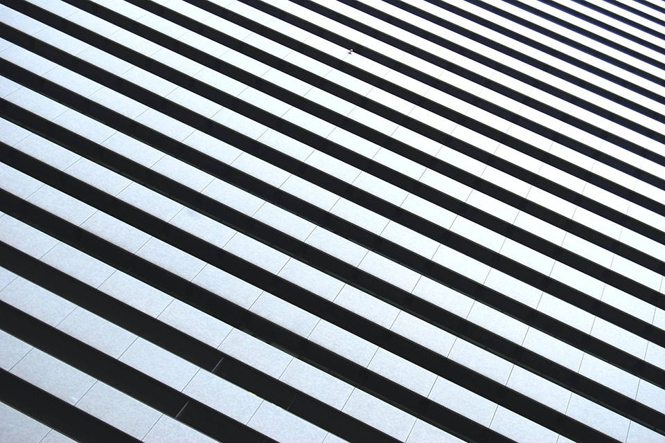
Research indicates that too many patterns, such as monochrome high-contrast striped wallpaper, may be, in fact, causing head pains and migraines for many people.
Over the past year with more people spending time amongst their bold décor choices, Google searches in the UK on the topic of headaches and migraines have increased by nearly 50%.
Search terms on the topic were at 739,000 per month as of January 2021, showing an increase of 44% compared to January 2020.
The Science Behind It
Of course, this information isn’t just coming from the mind of an interior design connoisseur. A group of researchers from the American Headache Society discovered that certain patterns in art could make observers feel physically ill.
Participants in the study were asked to view the pictures below containing stripes and conflicting colours, and then discuss how each set up made them feel.
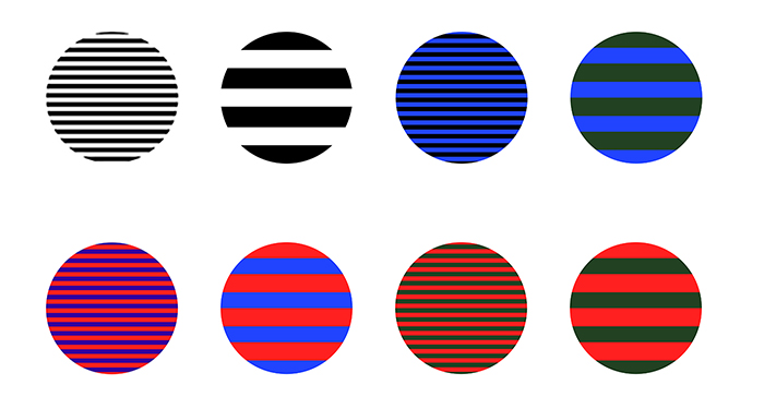
Images with strong contrasting colours were found to have the biggest effect on participants, and those with simple stripe patterns with exact repeated distances even caused headaches for those that observed them.
Other experiments that have taken place to test this theory have also included exposing people to geometric and stripe patterns to see which one causes the most visual discomfort. This experiment presented a similar result to the above.
One reason why this physical, and painful, reaction happens in this situation, is because the brain can become overstimulated with extreme patterns that simply don’t exist in the natural world.
Therefore, our minds struggle to process the images of unnatural tones and busy designs together and, as a result, a headache occurs.
The repeated, unnatural patterns in these rooms may have looked good on the wallpaper site, but, in reality, and our living rooms, they can cause a nausea-inducing optical illusion.
How to Tone Down Your Décor
If you need to, stay away from extreme contrasting lines of block colour and change the size of stripes, and the distance between each, to make the decoration more ‘natural’.
It also helps to add in slightly wavy lines to make it easier on your brain. Ultimately, you can always cover up the negative patterns in question, possibly breaking up the pattern with a frame or two.
Also, avoid stark hue clashes like black and white, blue and black, or red and blue that are repetitively spaced. It might look good on a referee, but maybe not so on the walls of your home.
Although these rooms aren’t filled with crazy designs, the overwhelming colours are a little too much for our eyes and brains to process.
It may not seem that placing red and black vertical stripes next to a faux zebra head would have that much of an impact on our psyche.
Yet perhaps it’s time the budding Lawrence Llewellyn Bowens amongst us stopped blaming those migraines on the computer and take a look around instead.
So, if you feel like you've caught the design bug this year, perhaps have a re-think before you paster your walls in a headache-inducing hue.